Design walkthrough
Returning to the results of our exploratory research study, one of the core goals of the Mesh platform was to enable prepared, up to date, and safe climbers. This end objective broke into a series of design challenges as described below.
Route and region exploration
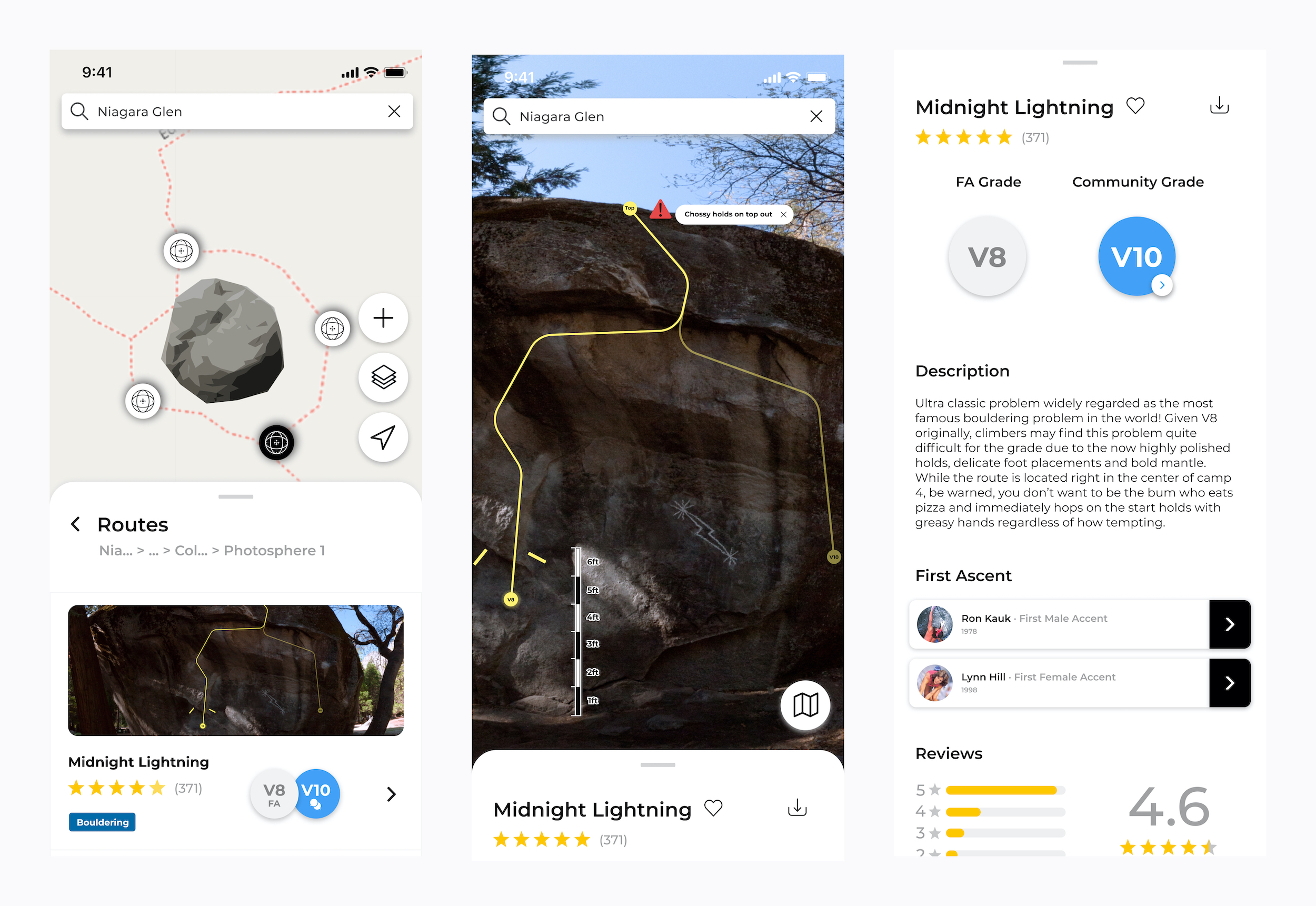
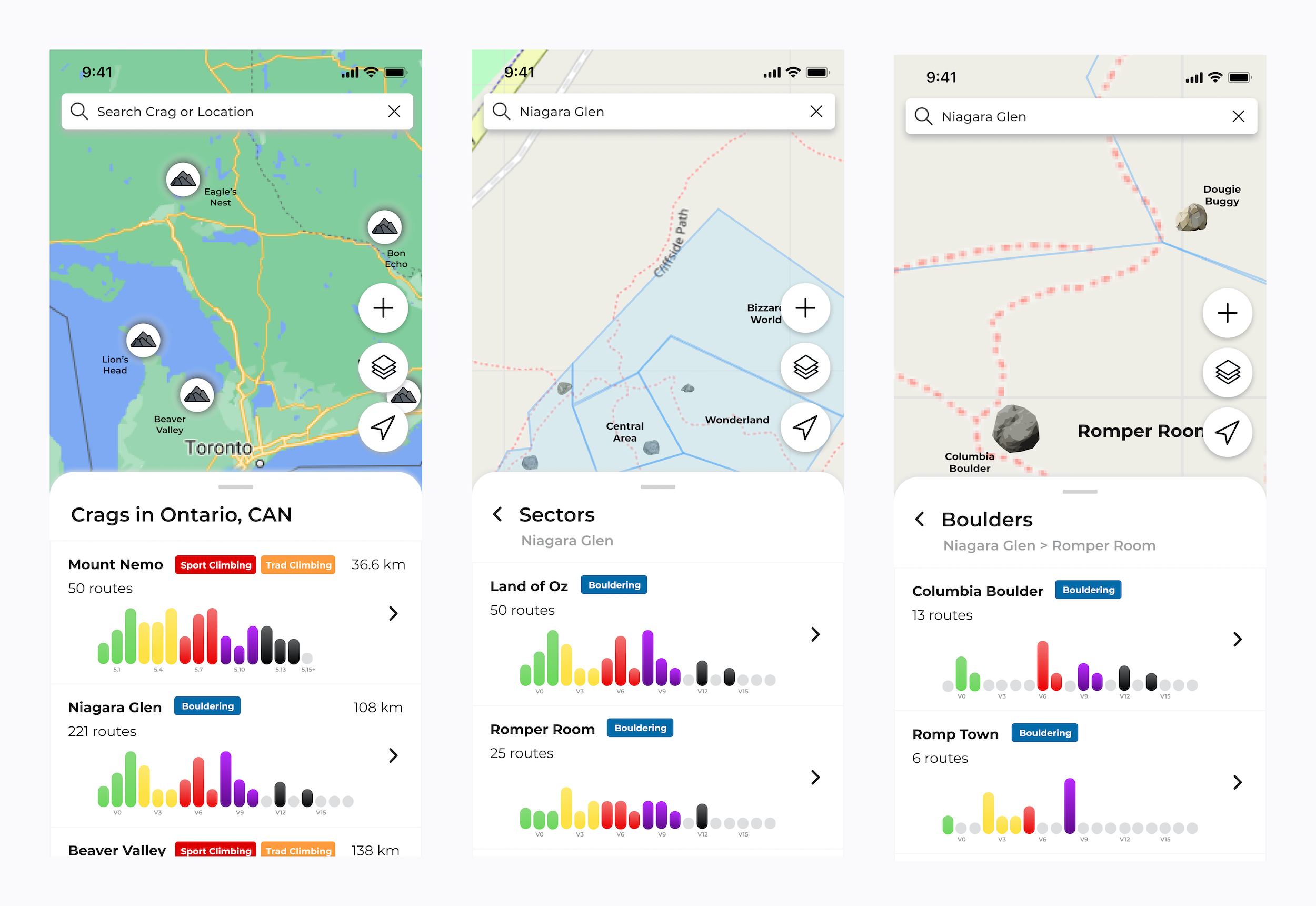
The first of these challenges was how climbers explore routes and regions. Currently, the status quo is seeking out information from connections and/or purchasing a guidebook if enough interest is sustained for a given area. From exploratory interviews we heard this paper based method can be costly, occasionally hard to source, and makes travelling outside of local regions difficult to plan. These difficulties lead to more climbers arriving unprepared or relying on out of date information sources. Mesh simplifies this process by providing a consistent and intuitive map based experience where climbers can locate and explore climbing regions all around the world.
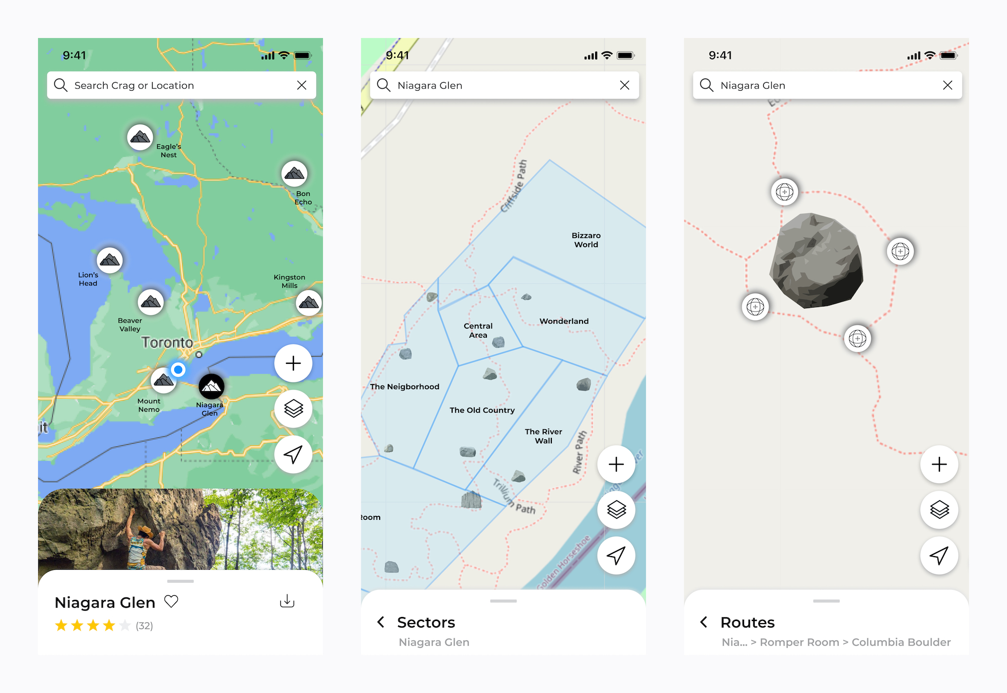
Each climbing location, also known as a “crag” can be split into various "sectors" and then again divided by each boulder or wall in the area to provide clear and consistent organization. In our final round of usability testing, exploring routes and regions was consistently met with great enthusiasm and one hundred percent task completion finding both a boulder of the participants choosing and a specific climb supplied by the facilitator.
To additionally aid in the route and region exploration process, at each level of the map view climbers can slide up a floating panel list view where information can be found about the type and difficulty of climbing within each subset of that area.
When discussing safety with climbers from across North America, a common theme emerged in the stories we heard. Many close calls, errors in judgment, and unfortunate accidents discussed were fairly preventable given better expectations being set before leaving home and enhanced communication between local climbers in an accessible location. As such, numerous designs were ideated, prototyped, tested and refined to produce the following features.
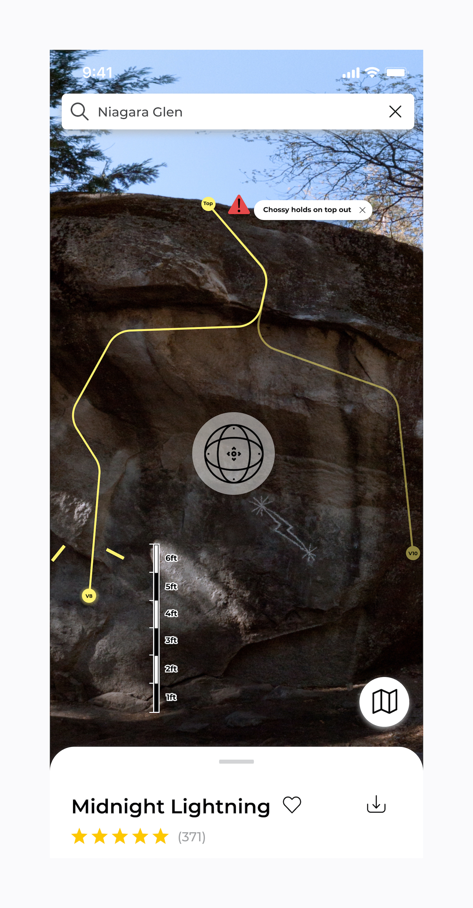
Each route visualization is a complete photosphere allowing full preview of the environment surrounding the climb much like Google street view. From boulders we heard how important seeing not only the climb but also the landing and topography around the boulder is to prepare the right number of pads, spotters, and not fall victim to sunk cost bias trying a problem you’re not prepared for. Trad climbers indicated locating routes without bolt lines can be tricky but full photospheres would allow even more opportunity to use surrounding features to identify the desired route. Similarly from alpine, sport, and ice climbers alike, the idea of having full photosphere route previews embedded into the platform was received positively for its route preparation and navigation potential regardless of how much additional storage space it may require.
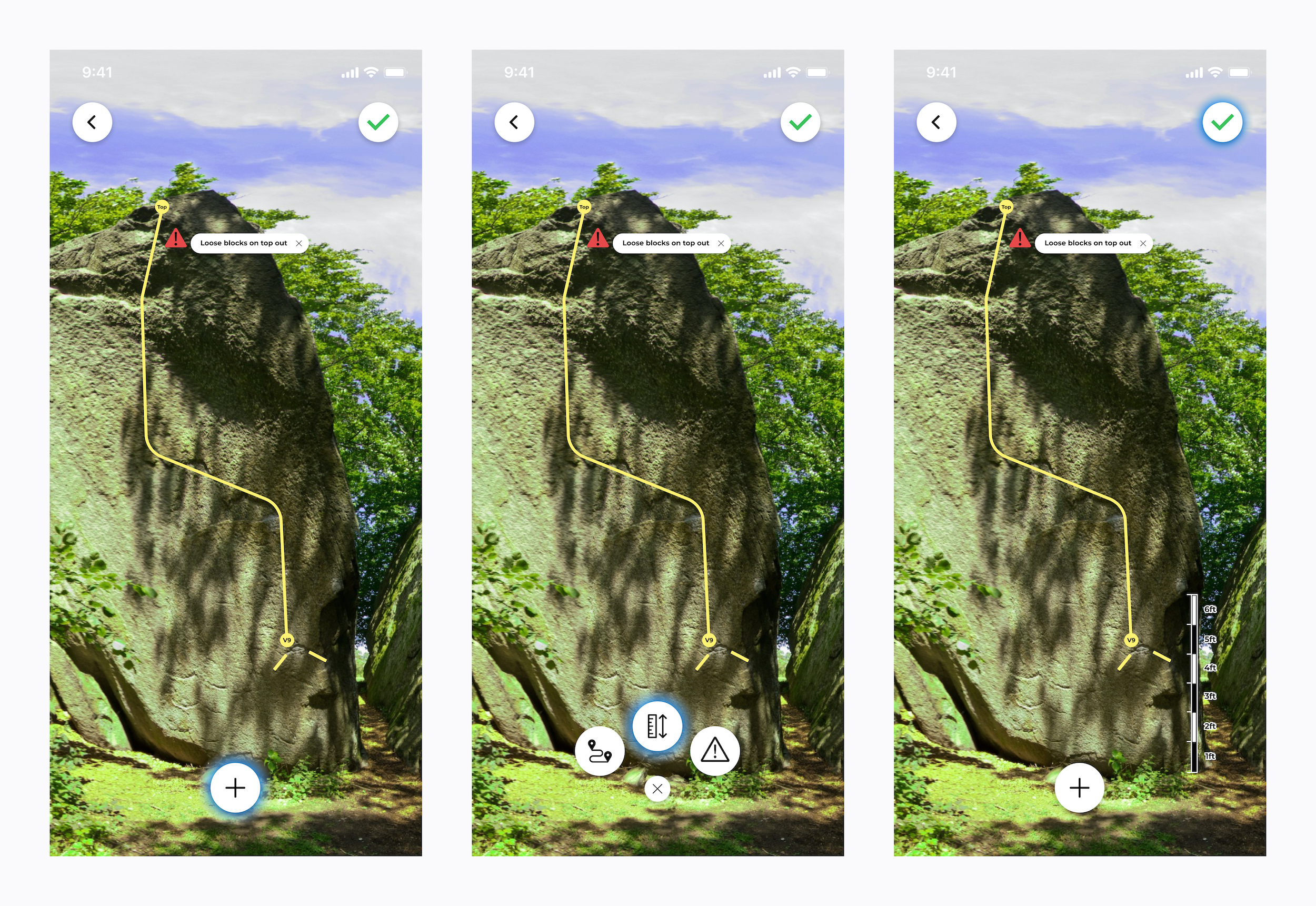
One quite remarkable theme from our initial exploratory interviews was that despite the fact high quality route images are becoming the status quo in guidebooks, many participants indicated rock walls and boulders often look completely different in person. Digging deeper into this discrepancy revealed that it is mostly due to the fact that the surroundings, angle of the images, and the size of the wall/boulder are mostly unknown. Mesh addresses these issues by adding in scale markups that visually communicate how large the wall is. Additionally, each photosphere is positioned on the main map view to communicate spatially how each image captures the scene. Concept testing these features resulted in overwhelmingly positive feedback with the common suggestion to take this one step further and look into incorporating VR into the exploration experience.
In terms of safety, one of the largest frustrations with using physical guidebooks is the static nature of the information. Participants in our exploratory research and concept testing sessions indicated they often monitored Facebook groups and the occasional forum but most information posted is not relevant to them, and what is relevant is often easy to miss. Allowing climbers to post at multiple levels on the mesh platform allows the right content to be broadcasted to the right people. Route specific updates such as anchor maintenance, cleaning, loose holds can be well documented for all to see directly at the route information level leaving important region updates to be seen by all at the crag level. For more permanent warnings, caution markups can be added directly to the route preview images to ensure dangers are communicated to visiting climbers, an idea brought up in a concept testing session and strongly supported by future participants.
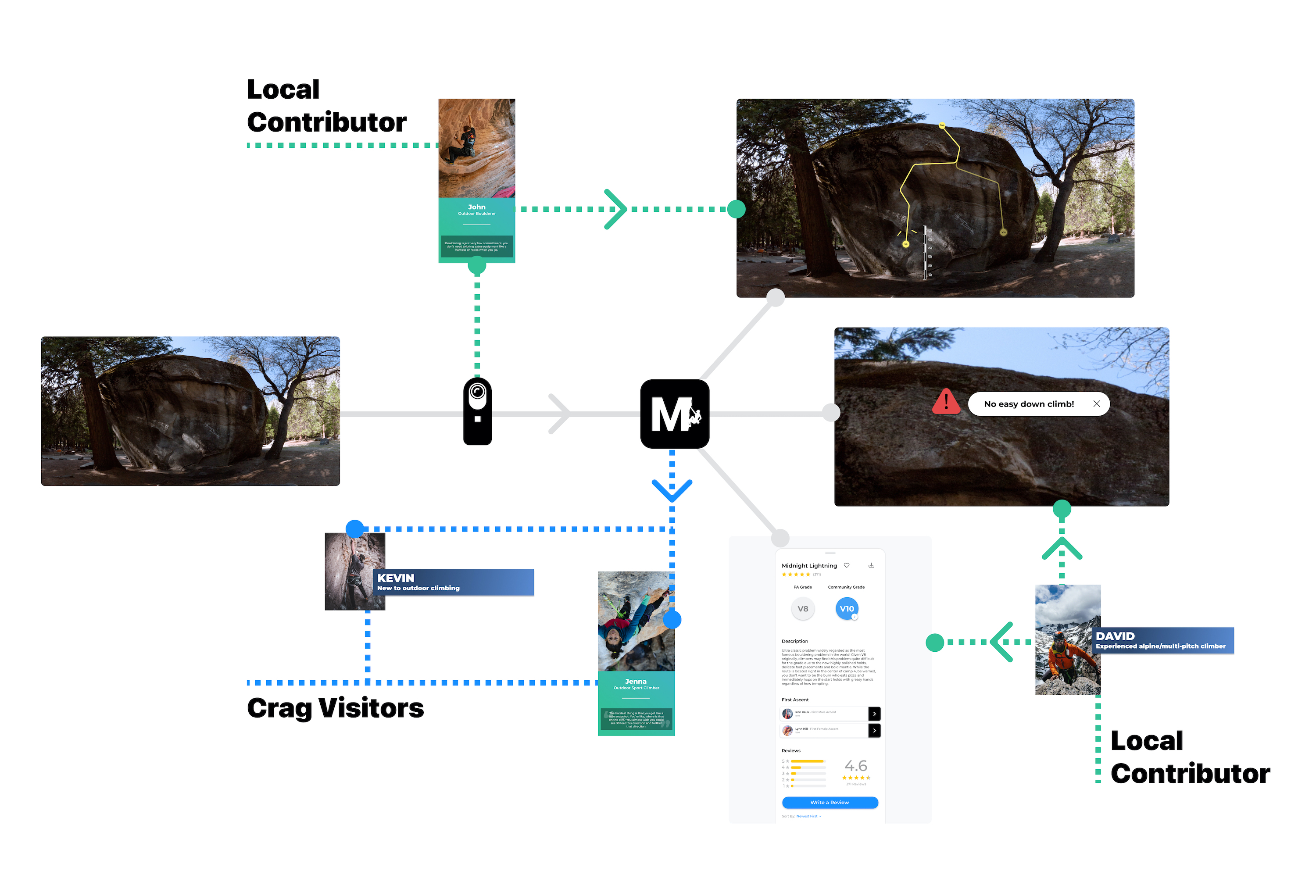
Due to the safety critical nature of nearly every piece of route and region information contributed to the Mesh platform, a large emphasis was placed on understanding how information quality should be upheld. Participants in our research overwhelmingly pointed to allowing anyone to easily provide updates, comments, or flag safety issues. This way there are no barriers to reporting safety critical information that may be useful to other climbers. This being said, nearly a quarter of our initial exploratory research participants brought up the concern of having incomplete or incorrect information if the platform was free for anyone to create, edit, or delete main route and region information. Worth noting, the concern was if the platform would be complete enough, and less so if the information was perfectly accurate. Interestingly, nearly all participants emphasized they take information from any source with a grain of salt as routes and conditions can always change. From a competition analysis conducted on community based climbing websites it was noted the vast majority of core information was provided by a small percentage of users, while a wide audience range viewed the posts. As a result the Mesh platform was designed with two user types in mind, a “local contributor” who is able to create, edit, and delete route and region information, and a “crag visitor” who is limited to only posting and flagging information. Local contributors would be required to be approved for each region they wish to contribute to and complete an interactive tutorial to ensure expectations of their contributions are set clearly. This split was seen as a great tool for encouraging only dedicated climbers to contribute, however, during concept testing it became prevalent that it is crucial all pieces of information added to the platform are transparent in terms of where it came from and that any user needs a clear way to flag information they believe is inaccurate. This area of feedback is a weakness of the current design but has been ideated upon and can be integrated into future iterations.
We’ve now seen many of the bells and whistles of the platform design, but what’s the big picture value Mesh can deliver? The following system diagram demonstrates how value is created for climbing communities when utilizing the mesh platform.
As we can see, local contributors such as John and David contribute valuable content to the platform in the regions they know best. Crag visitors such as Jenna and Kevin utilize this information to explore and enjoy their trips in a safe manner. Core route and region information, posts, updates, and markups all can be centrally hosted on the Mesh platform allowing for a more prepared and connected climbing community.